Sunday, October 31, 2010

Mmm...Slab Serifs


Via Graphic Exchange

Why aren't all study guides this beautiful?


Ligature, Loop & Stem Poster
Scott Boms, Grant Hutchinson and Luke Dorny
Lunar Caustic Press: Neil Wismayer


I came across this poster on FPO immediately after I barely survived that absolutely brutal type test. FPO is yet another brain child of Armin Vit and Bryony Gomez-Palacio. "FPO is a blog dedicated to both the visual stimulus and the detailing of the development and production of printed matter..."

I'm finding FPO helpful in seeing the technical details behind producing printed matter. The cost, timing and many finishing choices are sometimes a mystery. It's nice to read about designer's thought processes, technical steps and various setbacks throughout a project.

And I just like looking at pretty stuff.

Thursday, October 28, 2010

Gastrotypographicalassemblage


I happen to come across vimeo.com through someones tumblr and found some really cool videos that people are welcome to upload at a high quality. While browsing through the different staff recommended videos I found a video on a wall built by an artist named Lou Dorfsman, who passed away in 2008.


The title of the piece is Gastrotypographicalassemblage, and it was commissioned by CBS to be placed in their cafeteria in 1965. The wall is 33 feet long and 8 feet high, and consists of about 1,450 letters.

It really struck me as a beautiful piece and I was disappointed to find out that it was torn down without much thought. However, an artist had salvaged the piece and stored it poorly for about 20 years before they began to restore it. Many of the letters were worn down beyond repair, and although it took a while, it has recently been opened at London's Kemistry Gallery

Wednesday, October 27, 2010

Just doing some perusing.


So I did not really have a theme or anything for this post other than things I thought were interesting and this is what I found...

Ron Thompson-
I really like his portfolio. Ron Thompson
works in a lot of different styles and flipping through his portfolio is quite interesting, I liked the Royal Elastics campaign the most because of all the different hand done type treatments he explores within it. I also really like the fact he takes the hand done approach and applies it in many different ways throughout the brand's posters and magazine spreads.
+ his "Stop
Breathing" label at the top is also a lot of fun, and I think it's cool that he can stay true to himself with his design, and he includes personal illustrations at the top of his list of works. He also worked for Kanye West, what could be cooler than that.

http://www.stopbreathing.com/#365156/Royal-Elastics


His Exopolis work is what initially caught my attention....


I also came across the work of BVD after their Smicker-Dubblera letterheads/business cards
caught my attention. Simple, clean, and bright. I liked it.


BVD also worked on the Swedish Design Award identity.

I also found Think Studio, and really liked their id
entity for Porcupine Group. I liked the way they mimicked the shape and color of porcupine quills within their typographic solution.


Tuesday, October 26, 2010

Weave Me a Web, Charlotte

Hand skills are a HUGE part of graphic design. However, between all the cutting and gluing and measuring and paper cuts and hunching over our projects moving as slow as earthworms I have often found myself longing for the days of 3D. Horrible, I know. This is, however, the reason for my post of....a typeface made from weaving! I found this little gem on behance (of course) made by the French design firm Zim and Zou.

The shapes that the string creates within creating the letter form itself is what makes the typeface all the more interesting. Yes some letter forms are a little more graceful than others and it would really only work on a larger scale but the thing that makes the type so amazing is that it has depth (in the photographic images at least).

Of course I might be completely bias because I am obsessed with all things handmade. However, if your not as cool as me I believe that the beauty of the type is still undeniable.

Monday, October 25, 2010

Disfunctional Type

While walking around this past week, I noticed several examples of type that were originally intended to be clear and informational. For a variety of reasons the type is being ignored. Here are a few examples of what I saw:


Although the type on the sign is designed to be legible, it is shrouded in a thick growth of weeds.


This image shows the effectiveness of the sign above. It is funny to see that the majority of the litter is clustered directly underneath the sign.


Perhaps this driver believes that if they park their car directly over the type that it will lose its meaning. If they had parked directly over top of the word “NO”, their chances of fooling law enforcement would improve.


This “Exit” sign, although legible from certain angles, no longer clearly depicts the quickest and safest route to an exit. The arrows alongside the type are not even pointing in the right direction.


Most of the examples I found were due to neglect over a period of time. The type was no longer able to perform its intended function.

Sunday, October 24, 2010

Looking Back

So, I've noticed how interested I am in with looking back at old typography. I think its super interesting when I see new and innovative typographic solutions. But, I think what I'm more recently really into is looking back to create something new. The letter press is becoming really popular, as you can see from out blog, which is what made typography in the past possible. The nineteenth century is an era that has really caught my attention. This is one image that I really enjoy:

While browsing the internet I discovered "19th Century Clipper Cards." I read into them and they were small cards used to advertise Clipper Ships that would take people from one port to another. They're really great little pieces of typography and the images are awesome too.


This is one that I really like("Wealthy Pendleton"). I think that the hierarchy works really well. We're learning a lot about hierarchy in Type class and I think that these are good sources of examples.


Here is another pretty one that uses a lot of ornaments ("Pearl"):


There are also some funny ones that incorporate the imagery well.

Here is a link to the Flickr account where I found the rest of the Clipper Cards:
Here is a link for the history of Clipper Cards:

Friday, October 22, 2010

Is There anything Dumber than Dumb Quotes?

For Ellen Lupton, the answer is an emphatic "No!". Speaking with AIGA Philly, Lupton, Director of the Maryland Institute College of Art's Graphic Design MFA program, discusses her typographic pet peeves, the promise of web fonts, and the latest edition of her book, Thinking with Type.

Thursday, October 21, 2010

HAND MADE TYPE!


So this past week I was surfing the net like a banshee! When allll of the sudden I stumbled across yet another beautiful entry up on behance.net. The type/photo above was created by Handmadefont.com. What got me excited about this photo was not only do I love cheese, but I also enjoy type and have many times tried to eat type as well. (turns out it does not taste as good as cheese) So upon further investigation of this font I stumbled upon the design firm Handmadefont. And the cheesiness doesn't stop there! Turns out these guys pump out fonts like cheez whiz straight out of the bottle. And we all know how good cheez whiz is...am i right!

Handmadefont, founded in 2008 by Vladimir Loginov and Maksim Loginov has currently created over 264 fonts and that number doesn't seem to be slowing down. Their approach is sharp, like a nice block of cheddar! To create type, they take inspiration from the things around them, and the things we all use on a daily basis. Want a font for that next project you're doing on clowns. Psssh...no problem, they've done it!

I think what I really get out of the doooood's at handmadefont is there level of commitment and ability to execute an idea to the fullest. Sometimes taking the simplest ideas can make the most beautiful imagery. Its a lesson we can all learn. And surely something we can all appreciate!

Here's some more amazingly gouda images!


Wednesday, October 20, 2010

Show Poster Typography

A lot of designers today start out doing design in their younger years by making posters and CD case liners for their friends' bands. Frank Chimero, one of my favorite designers right now, says in his FAQ page on his website that he started out doing all kinds of design for friends that had bands, and that's how he fell in love with the work.

[Sidenote: Frank Chimero has some really nice typographic work, too! He designed a series called Inspirational Design Posters that have been passed all around the internet. However, he's not the focus of this post. Maybe some other time.]

Since I have a little bit of a background in printmaking and also made a lot of flyers in high school for my friends' shows, I find gig posters to be really interesting. This week I found this collection of gig posters that I can't stop looking at. I love how each poster has its own look and feel, but how they all have basic elements in common. Each poster has to have the same type of information and the same kind of hierarchy (name of band must be most important, date and time and venue must be clearly displayed, etc.) but they all work under different systems to get this information onto the page. Some are extremely illustrative and decorative with the typography (Les Savy Fav, The National, Calexico) and some are very traditional and clean (Broken Social Scene, Mates of State, The Decemberists) but they all have organization that makes them easily readable to get the information you really need from a show poster.

I think good design thinks first and foremost about readability and whether or not the information makes sense to a viewer, and then after the kinks in organization are worked out, that is when a designer can start thinking about really making something beautiful.

Tuesday, October 19, 2010

Beautiful Calligraphy/The Naked Truth

Legacy of Letters from Luca Barcellona on Vimeo.

I came across the website ChangeTheThought that has a collection of different design inspirations, from print to interactive stuff. From this website I found this video about a designer named Luca Barcellona who does AMAZING hand done, calligraphic typography. He is definitely a master of hand done typography. I could not even believe how perfect his line quality is and how steady his hands are. I'm sure he has had a lot of practice to get his type this perfect. This is truly inspirational for me because I am becoming more and more interested in this type of typography.

Through his website I also found a really interesting project called
Wall of Light that he and many other artists participated in. This was a collaborative project that featured different artists and their artwork that was projected onto historic buildings. It reminded me of the post about Anamorphic Typography and the idea of type in the environment. When I first started in design, I thought of everything (especially type) in such a literal sense. However, as I learn more, I'm beginning to realize how much you can actually do with type and that it's not only limited to paper/print.

On another note, I thought I'd share other cool work which happens to relate to the post about body type called "Letterform for the Ephemeral". Check it out:


http://www.arjanbenning.com/
http://www.bodytype.ru/

Talk about thinking outside the box...

Thursday, October 14, 2010

Typollution

I was browsing youtube in search of fun typographic videos and stumbled across this interesting clip. I'm pretty sure it's made by some french guy...anyway, I thought it was really cleverly visualized and well thought out. I am usually drawn to more illustrative design, so the simple, but thoughtful use of type as imagery struck me as eye-catching. i particularly liked the (6)snail and the way the designer created the drips of rain. also, the segment with the smoke stacks was nicely done. The music is also synced pretty well to the video and its pretty catchy. Take a look:

Excuse My French

I came across a French designer named Christophe Badani. I would tell you more about him but his website is in French, a language that I pretend to know, but actually do not. However, from my pathetic research attempts, I have gathered that he has designed a few fonts, one of them being Linotype Rough. I personally am attracted to this typeface because it has a whimsical hand done quality.


He has some really interesting illustrations that deal with type in a beautiful and organic way. Sometimes type terrifies me because it seems really foreign and scary like calculus or organic chemistry, but illustrations like this make me appreciate type as an art
form and give me hope that I'll be good at it one day! I really enjoy his illustrative style. The way the letterforms interact with one another reminds me of work by Jess Hische. It's sophisticated and fun at the same time.

Put a smile on your Neutraface

As an avid webcomic reader, I'm always on the lookout for good humor. My original intention was to find an actual webcomic centered around the world of typography, but apparently no such comic exists.
But here are some good type-related jokes I did find:

Typographunnies is a site dedicated entirely to jokes pertaining about type. Though I don't mind the overall design of the site, a lot of the jokes are hit or miss.

I was able to come across some comics with type jokes in them:
XKCD


ChainsawSuit

And now for the grand finale! May I present to you, "Neutraface" by Jason Kinney

Fun and Print

I picked up these posters from fffound.com on a post made by a company called Telegramme Studio. To the posters, both show a very retro looks. The first seems to be more of a 1950’s type poster with the almost turquoise blue and the bolder, larger type. The differences in depth, and different ways they choose to show that are very effective in creating interest.


The older styled poster ( the second one) takes on more of a story based and illustrative approach and I think I jus like it more for that exact reason. It has a nice Albert Einstein quote, though at first it looks like an old ad. The really cool part is in the color choice, especially since their able to pull off using two different oranges in the poster that are not actually to drastically far from each other, nor to close.


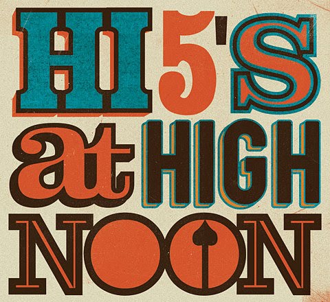
Both posters share likenesses in the flat, retro ad fashion the have, in some color parts of color theme, in background color, texture, and tone, and in style at all.

Telegramme Studio in a London based graphic and illustrative studio that utilizes heavy use of type and illustration together, or as a single unit. “Now in London, illustrators/designers Christopher & Robert draw, design, screen print, make patterns, are computer geeks, obsess over music, drink too much tea, are 1/2 dyslexic, collect stamps, post letters, raid skips and are mixing ink most of the time.” They also have a blog on their website that shows their work, videos that are relative to their work, things they like, or interviews of them in magazines thus far.

http://www.telegramme.co.uk/

Victoria

Wednesday, October 13, 2010


I was thinking about how hard it was in the past to set type and print in mass production. Because of this, printed items were expensive and many people didn't own printed items such as books. But I was wondering if people still had printed type all around them in their daily lives, even if they didn't own it. Turns out they did, printed money.

In ancient China 960 A.D., coins were made of round medals with a rectangular hole in the middle. The coins were then strung together with rope and carried around. If one became rich enough they found that the money was too heavy to carry around. Because of this, coins were often left with a trustworthy person and the owner of the money would be given a slip of paper recording the amount. Then one could return for their money. Later, these notes became money and were called "jiaozi."

The Yuan Dynasty was the first Chinese dynasty to use printed paper notes as the primary currency. This paper money was know as "Chao." So just because not everyone could afford nice printed things in ancient times, they still had the opportunity to see it in their everyday lives.


ILT

by Lauren Lucille

I found a few interesting things this week.  I stumbled upon a blog called "I Love Typography"  (ILT) which has a great amount of links to great type websites and plenty of interesting posts.

One of my favorite posts was "On Choosing Type" where the author explained that Typography was not a science and couldn't exactly be and that it was an art.  The author related new fonts to babies: "A new typeface is something like a newborn baby (though it doesn’t throw-up on you): don’t drop it, squeeze it too hard, hold it upside-down; in other words, don’t abuse it, treat it respectfully, carefully."
They continued to set up certain guidelines as to how to choose type.
The guidelines are:

1: honor the content (what is the text describing?  is it for a website?  print?)

2. read it (is it actually easy or is it almost exhausting to read through?  the author gave a blackletter font as an example).

3. the audience & canvas (consider the readers and the setting of the text.  who is reading your text?  is your text going on someone else's cramped design page?)

4. does it look right? (if it's going on paper, print it to check!  if it's for the screen, check both pc and mac.  it could be amazing in one area and a trainwreck  on the other.)

5. typography is an art and therefore subjective.  (if you're unsure about your own work, ask other designers and typographers for their opinions!)


Another one of the posts that I read led me to "The Type Director's Club" which is an organization based in Manhattan.  Founded in 1946, "The Type Directors Club is the leading international organization whose purpose is to support excellence in typography, both in print and on screen."  They hold competitions every two years and the participants come from all over the world.  I was looking through some of the winners from last year and found some interesting images:

for the category "books:"


for the "clocks" category:


for the "typelogo" category"


Monday, October 11, 2010

DesignPhiladelphia Event: Wieden+Kennedy

Society of Design Presents Wieden+Kennedy
October 11th, 6:00pm
The University of the Arts, Levitt Auditorium
401 South Broad Street

The Society of Design, a non-profit organization dedicated to multidisciplinary design education and community service, welcomes Lu Chekowsky, Associate Creative Director of Wieden+Kennedy.

"Find Your Voice" - a presentation about confidence, awareness, experience, trust, insecurity, ego, honesty, reality, nonsense, failure, playfulness, intention, improvisation, optimism, and risk.

Lu Chekowsky is an Associate Creative Director at Wieden+Kennedy New York and has worked on campaigns for Brand Jordan, Nike Canada, Talbots, Noxzema, St. Ives, Delta Airlines, Sharp, Cole Haan, Proctor+Gamble, The Ghetto Film School, and the National Multiple Sclerosis Society.

Free and open to the public

Friday, October 8, 2010

DesginPhiladelphia Event: Ellen Lupton Book Signing


Ellen Lupton: Presentation and Book Signing
October 14th, 6:30pm to 8:30pm
Art Institute of Philadelphia
1622 Chestnut Street

Please join Joseph Fox Bookshop and The Art Institute of Philadelphia with Ellen Lupton to “launch” Thinking with Type, 2nd Revised and Expanded Edition: A Critical Guide for Designers, Writers, Editors, & Students (Princeton Architectural Press, 2010. Ellen Lupton is a writer, curator, graphic designer, and Director of the Graphic Design Master of Fine Arts program at MICA. Books will be available at the Art Institute for purchase and signing from Joseph Fox Bookshop.
Free and open to the public.

More info here.

Thursday, October 7, 2010

http://www.behance.net/gallery/Ampersand-Food-Groups--Typography-Illustrations/597770

http://www.behance.net/gallery/Ampersand-Food-Groups--Typography-Illustrations/597770

Wednesday, October 6, 2010

Typographic Logos


This week I had been thinking a lot about how simple logos, especially typographic logos can become such famous icons. Who would have guess that a simple "M" could represent the most famous restaurant in the world? Imagine designing a mark that would represent a company so well, thatit'd dedicated customers would get it tatooed to their own bodies. That is the case for many with the Harley Davidson logo. This type blog , http://www.logoblog.org/nintendo-logo.php is all about regular designers, who hit the jackpot on their logos with the help of some good marketing to make some of the most famous logos the world has seen.


These last two images are along the lines of letterpress. The movie
we watched last week had gotten me interested so I decided to do some research. I stumbled upon a few photos that used metal type as the subject in a photograph without setting or printing with the actual type at all. It was a different and modern way of using these pieces of metal. The last photo is a nice example of what looks like to me, perfect kerning. The last two imag
es are from two paper dolls, whose studio is located in Wayne.
http://www.twopaperdolls.com/


A Closer look at Graffiti

So I don't know about anyone else, but graffiti has always fascinated me. Mostly because it takes me forever to figure out what most of it says because of all the ornamentation and what not. Well I came across this video a while ago that made me fall in love with graffiti in a whole new way. This Graffiti analysis software is ridiculous. It basically takes apart the artist's writing and shows it to you in 3d. Sounds weird but the video is awesome and the way they apply this new form of graffiti to walls and buildings is cool as well. Graffiti is definitely in it's own category of type thats not used too much in the design world that I've seen, but that doesn't make it any less important. I've always viewed graffiti as an art form (when its not crap written in a bathroom stall) and I hope after this video some people will change their opinion on graffiti in general.


Tuesday, October 5, 2010

Sara Blake's Awesomeness

While perusing abuzeedo (a great site for inspiration--specifically their typography section which can be seen here), I came across the works of Sara Blake, also known as (ZSO). I enjoy her aesthetic and style a lot, as well as admire how far she's come as a designer. For some of her works, she posts videos of the process that her work goes through.

I think it's important to share process. Watching someone work can be inspiring, as well as teach you a few things. It also enables you to delve further into the creator's mind frame when they create their work.

I feel like that's something that's been pushed a lot so far in junior year--the idea of putting up a lot of work during critiques this way you can follow the train of thought and development. Showing how you went from one stage to another. Process is also progress. You can learn so much from watching your own progress--seeing where you might need improvement, where to back track, or what works best for you.

I also just really love seeing works come to life. Enjoy!


Monday, October 4, 2010

A Place for Inspiration

For this blog post I thought I might suggest a place to get great daily inspiration for Typography, Design, Hand drawn type, even collage - but mostly type. I check this blog out pretty regularly and can find myself getting lost in its archives - www.friendsoftype.com

Normally the entries are interesting takes on well known phrases, song lyrics, old wives tales, quotes etc. It's always awesome to see how some of these artists pick a direction and run with type.

The site also features links to the artists' websites so you can follow up with viewing the rest of their portfolio if you see a type treatment you like.

Here's a few treatments that caught my eye while scrolling through the first few pages :

Nice and clean curlycues
death of the dictionary
computers take on hand done with highlighter
just nice
clean, funny, soft
Spend about five minutes on The Friends of Type and you will surely see the amount of work uploaded into that blog, enough work to fuel many many ideas to come. Hope this helps somebody stuck in a creative rut.

P.S. two typographers I found through the site that I am a big fan of now are:
Ed Nacional - www.ednacional.com
Jon Contino - www.joncontino.com

And there you have it, for your viewing pleasure.
WH


Sunday, October 3, 2010

La Mujer Murcielago and Montgomery Park


Bat-Woman*

I was having dinner at El-Rey (19th & Chestnut) and this poster caught my eye. That G is pretty awesome as well as the way the Rs and G extend below the baseline. I've been thinking a lot about hand drawn type, especially on an angle like this (although, I'm not 100% that this poster was hand lettered or not). Maybe it was the festive atmosphere, but the type seems very alive and active in the space even with so much going on around it.


Montgomery Park, the former home of the Montgomery Ward Catalog House and Retail Store in Baltimore, has a great art deco sign. The building opened in 1925 and the typeface chosen for the sign is a wonderfully squared-off sans serif. The warm red glow of neon welcomes you to Baltimore and softens the hard angles. I rode past this sign again last night and thought that it was a good choice for a department store. It is welcoming and inviting, stable, sturdy and reliable but underneath is all, it means business.


*apologizes for the grainy cellphone pics.