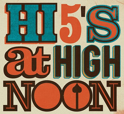
I picked up these posters from fffound.com on a post made by a company called Telegramme Studio. To the posters, both show a very retro looks. The first seems to be more of a 1950’s type poster with the almost turquoise blue and the bolder, larger type. The differences in depth, and different ways they choose to show that are very effective in creating interest.

The older styled poster ( the second one) takes on more of a story based and illustrative approach and I think I jus like it more for that exact reason. It has a nice Albert Einstein quote, though at first it looks like an old ad. The really cool part is in the color choice, especially since their able to pull off using two different oranges in the poster that are not actually to drastically far from each other, nor to close.

Both posters share likenesses in the flat, retro ad fashion the have, in some color parts of color theme, in background color, texture, and tone, and in style at all.
Telegramme Studio in a London based graphic and illustrative studio that utilizes heavy use of type and illustration together, or as a single unit. “Now in London, illustrators/designers Christopher & Robert draw, design, screen print, make patterns, are computer geeks, obsess over music, drink too much tea, are 1/2 dyslexic, collect stamps, post letters, raid skips and are mixing ink most of the time.” They also have a blog on their website that shows their work, videos that are relative to their work, things they like, or interviews of them in magazines thus far.
http://www.telegramme.co.uk/
Victoria


No comments:
Post a Comment