Monday, October 31, 2011

Melinda Beck


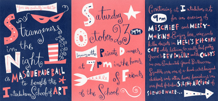
Melinda Beck creates a lot of her own hand-done typography. I didn't realize that I had seen some of her work from Noggin, the version of Nickelodeon for a younger audience. She created the cute, collaged characters for the animations she made.

She has has created book covers and images for magazine spreads as well and likes to mimic cut paper in her typography. The cut paper elements help to create a visual hierarchy in her work.

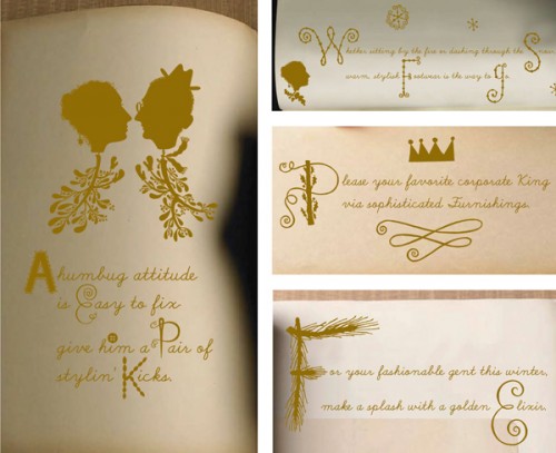
The last piece is still using hand-done type in a more sophisticated look than her previous work. Again the drop caps that she creates and embellishes break up the text to create hierarchy and more visually intriguing.


Ritator-The Royal Institute of Art Degree Show

Ritator's Swedish design agency made these really amazing book designs for the The Royal Institute of Art Degree Show, no two covers are alike.


Also there's lots of cool things happening on their website, feel free to check it out, here.

What Type Are You?

Presented by Pentagram, this interesting little interactive video judges and assesses your personality and then equalizes them into a typeface that is consequently a representation of you. While it's possibly a little bit silly, it's interesting to see how closely you can agree with your results, in a similar way to finding out your astrological symbol.

Not only is this presentation fun and well formatted, but it's well designed for how few functions there are. It's even a little educational; when your representational typeface is selected, a little history and meaning of the typeface is explained, giving the user another opportunity to draw parallels between the type and themselves.

http://www.pentagram.com/what-type-are-you/

Saturday, October 29, 2011

House Industries


http://www.houseind.com/

Known as a prolific world-wide type foundry, House Industries has had a major impact on the world of design. Unfortunately for us students most of the fonts that they have on their website are expensive to buy, but its still cool to check out all the different ones they have to offer.

You can also sign up and get a free catalog and download a few fonts for free.


Jon Contino

http://joncontino.com/
This guys hand lettering is so cool!

Friday, October 28, 2011

MINIMAFORMS memory cloud


Memory Cloud: Detroit Documentary Teaser from Derek Schultz on Vimeo.

For three nights the sky above Woodward Avenue in Detroit was filled with bellows of smoke and light as the artist studio Minimaforms transformed the Detroit Institute of Art into a transient light environment. The ephemeral clouds acted as smoke signals, each cloud carrying a unique message and story. Memory Cloud Detroit was a platform that offered the people of Detroit an opportunity to engage in a dialogue about the city. This interactive space animated the DIA Woodward entrance with stories collected from the public. During the two weeks leading up to the event, messages consisting of memories, stories and personal aspirations for the city of Detroit were collected and archived on-line at Voice Of Detroit. Each individual expression became a part of a continuous story about the city, a narrative written by participants over the duration of the project transforming the steps of the DIA into a dynamic space for communication. Audience members were also able to contribute messages via text-message during the performance each night. These collected text messages will be added to the Voice of Detroit archive, becoming part of an evolving diary and a voice that will speak of Detroit’s past, Detroit’s present and Detroit’s future. An archive of collected stories and documentation of three day performance will go live at Voice of detroit in the coming weeks.

Cramped Hands and Machines with Tourettes

These are some artists I found while scouring the web.

Bianca Chang is an Australian designer who does type sculptures using layers of cut paper. The level of precision is pretty remarkable.


Bianca's website.

Rob Steward is a New York City artist and programmer who created a machine that displays four letter words from a database using fluorescent lights. The words have a tendency towards the dark...


Rob's blog about the creation process

Thursday, October 27, 2011

Type Games


Another fun typography game from Method of Action! This one also helps you understand the logic of bezier curves which are used in Illustrator.

more internet type games

I've been following the reddit design and typography pages for the last few months. They're an excellent source of inspiration, but more importantly (because we already have stumble for inspiration) a great forum to get help for rookie questions and see professional opinions and discussions. These are some of the recent highlights.

the new justice music video.

for those of you who enjoyed the kerning game, there is also a typeface counterpart here.

Ryan Gosling doin' his thang.

an interesting beatrice ward quote

and a thread explaining the functions & foundings of font file formats

Wednesday, October 26, 2011

Tasty Tactile Type!


Everyone should really check out artist Dominique Falla's work with typography. His style and body of work is tedious and time consuming. I can only imagine how much time and effort goes into making one of his projects. You can tell he puts a lot of time and effort into every little detail. Falla creates type with thread, map pins, vinyl, and even made his typography edible! Confused? Check him out! http://www.dominiquefalla.com/


and just for fun and because we're probably starving right now... http://typography-daily.com/2011/10/13/typography-made-of-bacon/

Friday, October 21, 2011

Intense Fonts

I'm sure she is already somewhere in this blog, but if you haven't heard of her, you gotta check her out. Her name is Marian Bantjes. She's a typographer, designer, writer and illustrator, and she is known for her obsessive hand work, her detailed precise vector art, as well as her crazy patterns and ornament. I personally find her fascinating, and I hope you do too.

Her book! (that entire page is actually a typeface!)


Ballpoint pen on paper of the explorations between "you" and "me":


Unboiled noodles:


Beautiful Ascenders & Descenders...woah!


Last semester in my mosaics 1 class we read the book A Thousand Splendid Suns by Khaled Hosseini. I don't think that there was a movie to go with the book, so we watched the a movie to his other book instead. The first book of Hosseini was cis called Kite Runner. It was suggested to us that we should read it after we had watched the movie, but who does such things. I was pretty skeptical of the movie at first and just planned on drawing in the dark, when the intro came began to play... http://vimeo.com/3202924 ... at the time, I was in awe at the introductory credits that I saw. The washes of color along with the extreme ascenders and descenders made my evening.

After nostalgic thoughts left my head on that subject, I decided to look for more type based videos and found one by a band that I was just listening to o keep was http://www.youtube.com/watch?v=d3ak1zXcqik&NR=1

This one is really... weird? http://cshaver.wordpress.com/2011/06/22/great-type-based-music-video/. If I fall asleep don't try to wake me , cause i can't hear you.... because It's loud with the shop vac on :D

Paix

Thursday, October 20, 2011

Images That Really Say Something

I think typography interests me most when it is treated as both image and very legible type. It's probably the art student in me that wants everything on the page to be as integrated as possible, and type that isn't actually made up of two-dimensional letterforms has always been very striking to me.

In my search for typography that has that dual legibility, I found one designer who definitely makes image and type inseparable.


Sean Freeman creates these typographically, and visually, beautiful pieces, saying that while pretty much anyone can create visually arresting typography, he works very hard to retain legibility. Some of his pieces are more conceptual like the above piece, while others are just very beautiful to look at:


His website is also really nice, and you can really see up close just how impeccably he crafts his letterforms.

Along the same vein, I came across the same idea of literally integrating type into imagery, but this time in a different medium. Designers Stefan Sagmeister and Hillman Curtis created this awesome short video advertising the movie they're both directing: "The Happy Film". This one was really interesting to me because of the way, in this case, type becomes mobile. Like Freeman's work, the type becomes the image.


The Happy Film

Friday, October 14, 2011

Type that can't be printed out

The more I progress into the major, I realized that I barely have time to do fine art that involves physically creating a piece out of things other than paper. Because of this, I was drawn to artists that create physical, touchable, interactive pieces while still heavily focusing on typography.
I was drawn to fromkeetra.com because the pieces are all made out of different materials while still retaining basic typographic hierarchies.


Everyone loves hidden letters.


This piece juxtaposes the illusion of minerals occurring in nature with the type that is definitely mad-made. It is entirely made out of melted wax.


Thursday, October 13, 2011

Wow! (Type) Gorillas

In honor of the Bristol Zoo's 175th anniversary, the zoo initiated a public art event which commissioned 60 artists to transform a life-sized gorilla statue in order to raise money and awareness for gorilla conservation. Tom Lane and Ged Palmer teamed up to create an award-winning typographic solution. I really love how they handled the type, especially how they worked the type into the contours of the gorilla's body with such ease. They have basically created a 3d poster which is an awesome concept.

The design was based around the a butcher's diagram, and is hand lettered facts about the bush-meat trade in Africa.


Another really neat aspect of this creation is how they presented it. After they finished with the type they covered the sculpture in a heat sensitive paint. Throughout the day, the sun warmed the paint and the typography underneath became visible. When it cooled down the type disappeared to emphasize the disappearance of gorillas in the wild.


http://www.behance.net/gallery/Going-Gone-Gorilla/2167139


While looking at the portfolios of the Tom and Ged, I found some really cool stuff.

http://gingermonkeydesign.com/portfolio
Tom Lane- This is an illustration in his portfolio I feel completely in love with.


http://www.gedpalmer.com/index.php
Some interesting type sketches from Ged Palmer's portfolio


Letterforms have sounds too!

Julius Popp's Bit.Fall

Although water has no shape or form, it takes on letterforms. Popp creates this unique machine that makes words out of water. I thought this was pretty interesting because he combines science and art to make you feel the words as they fall. As soon as you read the words in the 2 second it freezes in space, it disappears.


http://www.youtube.com/watch?v=AICq53U3dl8


Meek FM Typographic Synthesizer

Rob Meek and Frank Muller built this awesome synthesizer that lets you adjust the sound based on the letterform. For example, there's one knob that lets you adjust the serifs and another that lets you play with how think or thin the forms get. It's almost as if the forms are talking!

http://www.youtube.com/watch?v=1he0uQZB0K4


Infamous Movie Typography!

I've always been a big movie buff, so I love when I find an artistic form of expression that combines some or all of my favorite interests. In this case it happens to film and design, specifically typography. There are countless brilliant uses of type in film, but these are some highlights : These opening or closing title sequences manipulate typography in a way that fits the genre and feel of the movie while simultaneously hinting at what is to come next while not giving away too much information.

And this one!


Oh and this:

Tuesday, October 11, 2011

FontFace


fontface from atipo on Vimeo.
Atipo is a designer from Spain.
I was surprised by how clean they could do this makeup!
His website also includes very nice contemporary packaging.

& Food.

These ampersand designs by Dan Beckemeyer look disgusting yet impressive at the same time. These are based on cliche food combinations. More of his food ampersands and typographic work are on Behance Network.

Design Philadelphia

Starting this week: Design Philadelphia

They even have a workshop on resumes focusing on paper! Might be worth checking out.

Creative Typefaces

Sixty examples of very diverse and creative uses of type. They're helpful when you're stuck on a poster design or logo. I especially enjoy the designs by J.J. Abrams and One Twenty Eight. The three dimensional effect of Girard is very intriguing because it hard to determine if its real or computerized. I especially love the typeface created by one Twenty Eight because it is so intricate and decorative. The quality of the lines is very beautiful.

Monday, October 10, 2011

Typography Served

http://www.typographyserved.com/gallery/Hand-DrawnPainted-Type/2023057

This is an awesome link from an even more awesome website. It highlights a few hand done alphabets that are all, without exception really gorgeous. It's interesting because the alphabets all utilize different ways of creating type, despite them all being very illustrative display fonts. Some are based around line creating letter, while other are based around a very shape-centric method. And then some of them are illustrated type in the sense that they're almost more type than illustration. My favorite was the second and third one. I think the second one is based around an interesting concept. It's clearly based on the color blindness tests where pictures are composed of different colored circles. I think it's funny to think that if you used that font to type something out, and someone with a form of colorblindness read it, that action sort of exemplifies the concept while totally disregarding the point of typography. They'd be essentially doing a color blindness test while reading the font, but they wouldn't be able to read it correctly, per se. In that way, it does or doesn't communicate what it was meant to. I then really enjoy the second one because it seems to be based on muscular structures. I have a soft spot for anatomical studies and the like - I took Anatomy in high school - and this type, weirdly, is made of muscles. It'd be more interesting if the musculature of the letters was based off a supposed function ability that they would have if letters were organisms; where flexion and extension muscles would be.

Also just to add, typographyserved.com is just a really fantastic site overall for inspiration and seeing what's out there in terms of possibility in regards to type. Also check out the nepali typefaces article on their main page now. It's super interesting to see how things like serif, san serif, and different type movements (humanist, modern, etc.) are interpreted and handles by something as different from english as nepalese.

timbaaaaaaa

http://www.timbasmits.com/type

This guys has some pretty cool work. He does a lot of nice things with type as well.

Typekit.com

https://typekit.com/

This is a link to typekit. Typekit is a tool that is free and enables you to use fonts other than the typical "websafe" font on your website. We are no longer limited to Georgia, Helvetica, Times New Roman, Comic Sans, and Arial. There are lots of fonts available for free and if you really want you can pay to get the whole package. It is a very cool tool and has helped me and many others add charisma to a websites or blog.

Sunday, October 9, 2011

KernType

Want a fun way to practice your Kerning? Check out this fun game: KernType
You can kern letters and then see how closely they match up to a the original type solution.

Strickly Paper

Sure, typography conveys a lot of meaning but what about the paper it's printed on? Strictly Paper is an awesome blog that has a ton of different applications of paper; it starts from from humble origami pieces to an elaborate diorama. Some of the artists feature very cool 3D typography out of paper as well. They achieved a lot of dimension with flat sheets of paper. Some of them even go as far as making paper animated shorts. Below is just a fragment of the creative and painstakingly made paper crafts they have.

http://strictlypaper.com/blog