Thursday, September 13, 2012

Illustrated Fonts from Alphonse Mucha

 Two women with pale robes, one with flowers in her hair and the other with an ornate headband, sit either side of a bottle of Bénédictine liquor; the bottle sits on a pedestal and is framed by a decorative halo; the text 'Bénédictine de l'Abbaye de Fécamp' sits at the top of the posterA little boy in his pyjamas and a little girl in a red dress pull at a woman holding 3 cups of steaming hot chocolate. The words 'Chocolat idéal en poudre soluble' sits at the top of the poster, and the bottom of the poster has company details and an image of the chocolate powder in its packaging.
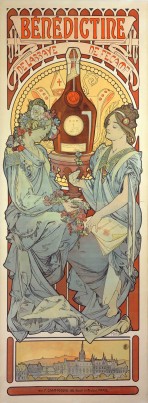
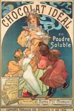
   I came across these posters while researching for my restaurant project, and I couldn't help but be fascinated by the type used in these images. The posters are by Alphonse Mucha, a Czech Art Nouveau painter and decorative artist who was known for his advertising posters, opera posters, and illustrations. These posters were done in the late 1800's when opera played a big role in French culture. To make these advertisements for the opera, not only the images, but also the type had to be attractive enough to draw in an audience. Most of Mucha's works were done by illustrating his own fonts and then using a lithograph to complete the work.
Decorative form with a couple against a moonlit landscape at the top, text in the middle, and approximately two dozen signatures at the bottom with a motif composed of different musical instrumentsTwo women and a man dressed in elegent evening wear sit drinking champagne with figures dancing in the background. The words 'Biscuits Champagne Lefèvre-Utile' feature at the bottom of the poster alongside a box of LU biscuits.An elegant couple in evening wear stand in a glasshouse surrounded by plants with 'Lefèvre-Utile' in the ironwork behind; the text 'Flirt' features at the top of the poster and 'Biscuits Lefèvre-Utile' at the bottomFront cover of a magazine with stylised title 'Fantaz' followed by hand-written text and a pen drawing of a classical narrative scene
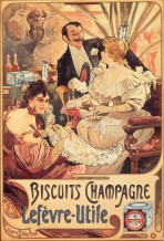
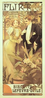
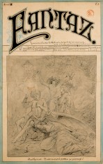
   While looking at these images, I was drawn to how Mucha not only creates a font that incorporates the mood of the piece, but also how he creates such intriguing shapes with the letters that integrate into their backgrounds. The images themselves are gorgeous illustrations, but the type ties in a specific mood and atmosphere to his pieces that are reminiscent of the time period in which they were created.
   The images posted above are only a handful of examples in which his beautiful type is expressed. My favorite of his works are his opera posters that can be seen on this website dedicated to his work.
http://www.muchafoundation.org/gallery/browse-works

No comments:

Post a Comment