Monday, September 30, 2013

Type in Physical Space


I was looking for some cool examples of typography in real life (most specifically typography made out of real objects), but nothing really interested me enough to share. That is until, however, I came across some examples of typography made out of the negative space of physical objects. As simple as they are, they are really strong and clear images, and it’s not a tactic that you would rather easily think of to do in this specific way.


While those examples might not be anything too exciting to you in the big scheme of things, they led me to find the artist Bela Borsodi. He is a photographer from New York, and upon checking out his website, I really enjoyed his work. However, the thing that stood out to me and that I wanted to share (and I mean, this is a typography blog), is the following pieces. Using a combination of negative space and objects, Borsodi created letters visible only when viewed from the right angle, and photographed them of course.


The attention to detail and the time that it must have took to accurately shape these letters just right is really awesome to me. His use of colors (i.e. light colors vs. dark colors; colors vs. neutrals) in order to create the idea of a typographic form in the physical space is a really inspiring tactic.


If you're interested in checking out Bela Borsodi's other work, here is the link to his website:

http://www.belaborsodi.com/single-images

Thursday, September 26, 2013

Type Expressing Music and Film

When exploring to find something worth posting, I knew I wanted to post some kind of video with type set to music of some kind, because I could probably be entertained for type videos for hours. I found an article of 40 type videos, linked here if anyone's interested, but what mainly caught my eye on the list was 2 music videos by a French electronic duo, Justice.

One of the things I loved about the first video, besides how stunning all the effects are, is that unlike many kinetic type videos each image stands very strongly on its own. Each word or phrase stands out clearly as a strong mark, and yet they are animated to still flow together. It's also pretty brilliant how each word imitates a retro logo. The colors and effects used in the animation also capture the song perfectly.


This next video uses animated type and illustration on t-shirts to illustrate the lyrics. Despite the lyrics saying "do the dance," the artists never dance at all in the video, they only calmly walk forward the whole time. However, I didn't notice this right away because the movement and energy of the song is still conveyed through the type.


One thing I took from this was the realization of how amazing it is that type can be used to express something as intangible as music or sounds. It's definitely something to remember if you ever have trouble getting your type to relate to your project.


I also wanted to share a something completely different I found when looking for videos. It's a video called Title Design History. I really enjoyed seeing the gradual progression from older films to more recent ones.


I wanted to post this because the website it links to, Art of the Title is a treasure trove of great type videos, with tons of title sequences form different movies and tv series posted, and even a section on different designers and animators.

Similarly to conveying the mood of music, this is a great example of typography being used to introduce the mood of a movie. The title sequence is the viewer's first impression, so it's especially important for the type to evoke the right feeling.


40 Days of Dating, Invitations and type on the human form


http://fortydaysofdating.com/

The first link is a website I found over the summer and I thought would fit well for this blog. These two NYC designers who both were unlucky in love found themselves single at the same time and decided to date for 40 days. This website chronicles their experiences with videos and daily questionnaires. Now how this relates to typography...Each of the 40 days has two unique type designs giving dating advice. Some of the text appears to be hand done along with the illustrations. These are not only funny sayings but the type styles and colors create a dynamic grid and element for the website. The typography transforms what could have been an interesting experiment into a stand out project.  

https://creativemarket.com/blog/2013/09/24/15-wedding-invitations-with-unique-typography

This second link features beautiful wedding invitations with hand done type. You're always used to seeing tacky overdone wedding invites with tiny script fonts. These invitations combine wittiness and great design. They have a more modern feel and relate more to the interests and personalities of the couple. 

Speaking of weddings below is the link to Jessica Hische's interactive wedding invite. You may have already seen it but it's pretty cool. I figured I would share this since she is a Tyler celebrity.  

http://jessandruss.us/

http://www.bellasugar.com/Font-Face-Paint-Atipo-17777623

Here is a different approach to type, one that is not on paper. This Spanish design group did a tribute to iconic typefaces such as Helvetica and Caslon by painting women's faces with the letters. This is a beautiful and unique expression of letterform that can be admired on the human form. It allows the font to be admired somewhere other than paper that also combines many art forms. 


It's Just a Piece Paper.


I first found Julene Harrison's work in the "Little Book of Type" by Emily Gregory. (For anyone who hasn't heard of this book, it rocks. It tells you how all of our favorite typographers transform their sketches to mind-blowing illustrations and typefaces). Julene Harrison's work stood out to me not only because of her intricate designs, but because of her craft. What I think is really awesome is how she sticks to classic typefaces, but makes them her own. I also thought it was mind-blowing that her pieces are painstakingly cut out of one sheet of paper and all the parts are connected. Another aspect to consider is her work is dependent on how it is photographed. These pieces are published online and in print, so the only way to reproduce these while maintaining its delicate character is very good photography. The shadow behind the paper is essential to show the viewer it is a cut out piece of paper.

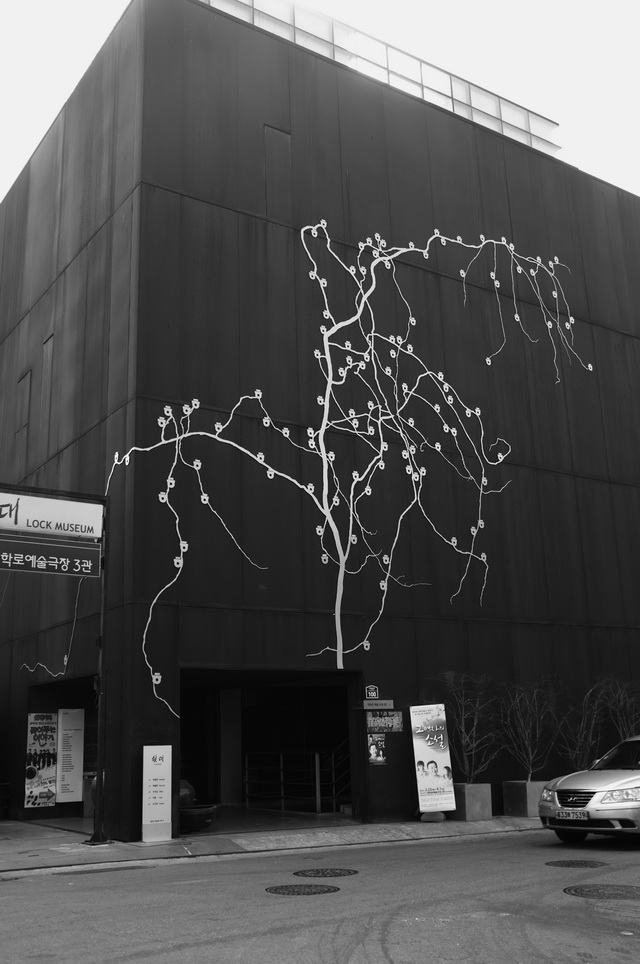
A Brief History of Korean Typography

In 1446, King Sejong the Great and his Hall of Worthies (a group of scholars handpicked by the king) released a document called 훈민정음, or The Proper Sounds of the Korean People. It contained the first recording of the modern Korean alphabet, Hangul; it was a project meant to replace the Korean writing system of Chinese, hanja, thus implementing a writing system that accurately represented spoken Korean and opened up the written language to Koreans other than the upper echelons of society that contained only rich male aristocrats. Hangul was designed to be taught even to the most illiterate Korean in a few days, containing only 24 letters. The design of the actual alphabet thus had an exact science to its design; every character fit into a perfect square, and each letter was a representation of the shape the mouth takes as it pronounces each one. However, Hangul was condemned by the literary elite who continued to solely use hanja. It became the language of the unprivileged, used mainly by female writers and writers of popular fiction.

Less than 60 years later, Hangul was banned by kings who felt threatened by their literate subjects; in 1504, a series of posters in Hangul by commoners mocked King Yeonsangun, an unpopular tyrant who responded by banning Hangul’s use. In 1506, his successor abolished the Ministry of Eonmun, the government institution devoted to the study of Hangul. Until 1894, Hangul receded into the background, occasionally surfacing into use for poetry and novels. The vehicle of a reformist movement based on Korean nationalism in the 19th century propelled it into official use for the first time in 1894, both in official documents and elementary schools. During the Japanese occupation between 1910 and 1940, Japanese became the official language and Hangul was again banned as part of the Japanese cultural assimilation.

Modern Korean typographic design was slow to start; after the Japanese occupation, the incoming civil war and the economic devastation in the south as a result meant that the evolution of design was suspended until the 70s, when the Korean industrialization brought the country back up from its knees. Other complications delay the advancement of typeface; approximately 11,172 characters must be accounted for in order to design a font for Korean. Therefore the availability of variant typefaces are limited and design has been occasionally limited to the English alphabet, in terms of branding and typographic treatment. However, led by efforts from designers/typographers like Ahn Sang Soo, the focus has swung back into Hangul as a design.

The following is a selection of typographic work from current Korean designers:

Our Korean Typography, Sulki & Min.

Wow, Jung Jin.

Bomb Fish on the Seashore. Poster for 558th Hangul Day. Ahn Sang Soo.
Smiling Flowers... Hangeul, Ahn Sahn Soo.


The Type Faces Project


                   Tiago Pinto’s amazing "Type Face Project" is the result of time away from his advertising job and his obsession with font. In 2011, Tiago Pinto, a Portuguese designer, decided to start a fun side project where he decided to play with type in Illustrator.

“In the summer of 2011, during a month off between leaving my agency in Lisbon and coming to Amsterdam I decided to start playing with typography and forms.”

            He had no particular rationale or concept behind what he wanted to do, he just knew he wanted to experiment with typography. He started playing with the word “Typeface”/”Type Face”, and thought how interesting it would be to have a face for every typeface, made up of their own characters! He started with the typeface Myriad Pro (the default font on Adobe Applications), and did a default/normal face.


            Turning Futura, Times New Roman, Courier and other familiar types into bold portraits, he comments “For me every Font has a face. So Bodoni is the Italian with a moustache, Futura is the stylish and good looking mid-life man, Times New Roman… well you got the point…”


            He ended up trying to give every font a face—according to the way they were perceived in his head, if the font had a personality, or a face. And so came the birth of The Type Faces Project

            So where does he see this project going? Tiago says, “Nine (9) is a number that I specially like, so The Type Faces Project will be completed when I reach nine Type Faces per category— 9 Sans-Serif’s, 9 Serif’s and 9 Miscellaneous (among Dingbats, Stencil, Calligraphic, etc).” 

Wednesday, September 25, 2013

Personality in Type

Most of us come into design with a very cloudy understanding of typography.  It's really not until your professor tells you "What font are you using? Never use it again", when you suddenly realize that you actually don't know anything.

One you start putting things into practice you start to get a feeling for the rules that seem to be general knowlege among more experienced designers.  It takes a long time, but slowly you start getting the feeling for what is generally a "good font" versus the "bad fonts". 

There is quite a bit of personality behind them.  They can be stiff and structured and come of as very businesslike, or sometimes quirky and fun.  There are dainty and delicate fonts as well as classic and refined ones.  You start to understand the humor behind them a little bit and things start falling into place. 

Being an addicted Pinterest participant, I'm constantly pinning things to my boards as inspiration I can one day hopefully use.  I never realized how quirky the typography universe could be, as well as beautiful. I've had many a laugh looking at images that I would not have understood without coming to Tyler. 

You know your college tuition is well spent when you can come out and say you learned enough to know when an image of Cats as Fonts is understandable as well as hilarious.

Doodles

As design students, we spend a lot of time merging (or at least trying to) different styles, methods, processes, and concepts into a combination of words and images. We, as visual communicators, have an important role in society to generate sometimes complex material into things that [normal] people can comprehend. Sometimes this means designing a poster, a website, or just simply a logo. We must succeed in creating something that holds up both visually and conceptually. Logotypes, specifically, serve as an identifying symbol and usually are designed to be permanent fixtures with the company/organization. However, the changing of times is often accompanied by changes to the fabrics of these companies and organizations, or alternatively the audience. The first logo might not fit the current, updated "image" and "personality." Things are constantly becoming dated, this relates back to the natural competition that exists in nearly every aspect of life.
Google is a company that I think is amongst the most iconic leaders in the digital age. Everytime you go on the internet there's a high chance that you start on the Google homepage, or at least travel back and forth to it. Easily the most used search engine, Google has had many logos since its origins in the late 1990s. The current logo that they use was designed by Ruth Kedar, and is based on the Catull typeface.


Google also uses fun, surprising, and sometimes spontaneous changes that are made to their official logo to celebrate holidays, anniversaries, the lives of famous artists, pioneers, and scientists and other important world events. These special logos, designed by artists all across the globe have become known as Google Doodles. They even host a contest for everyday art lovers to submit their own modified version of the Google logo. As students, it can be very difficult to either rely on typography alone or imagery alone. It can be even harder to merge the two. Google has mastered this art.


For a look at every Doodle that ever was, visit their official archive.

Type Beyond the Computer

In today's world, a large portion of the text we see, read, and write is viewed on a digital screen. From our phone, to laptops, to our television screens, we are reading pixels, day after day. I think it's important to remember that typography existed before the computer, and that there is a much larger range of creativity possible in a 3d format rather than on a 2d surface. Here are some recent finds of physical, touchable type that is captured in photography.

Anamorphic Typography by Joseph Egan


Anamorphic Typography, video receding in space:
http://www.youtube.com/watch?feature=player_embedded&v=A2Bvz-1rIBo

Anamorphic Typography by Ole Martin Lund Bo


Shadow Typography by Eerdekens


Various Works by Lo Siento

Extasis Poster: http://www.losiento.net/entry/extasis-poster


Wired Magazine with Bubble Wrap: http://www.losiento.net/entry/wired-magazine-lettering


Codica with Cats: http://www.losiento.net/entry/los-7-juguetes-capitales-swabb

4D Type: http://www.losiento.net/entry/video-4d-type

The Pinker Tones: http://www.losiento.net/entry/the-pinker-tones


When people think of graphic design, they often think of computers. And when I was in high school, I too thought that design was a realm that only existed in pixels to print. Design is so much more than just layouts, fonts, and keyboards. I really want to experiment with constructing design and type outside of the computer, and even 2d spaces. The examples above not only inspired me, but made me believe that I can do it! Maybe.