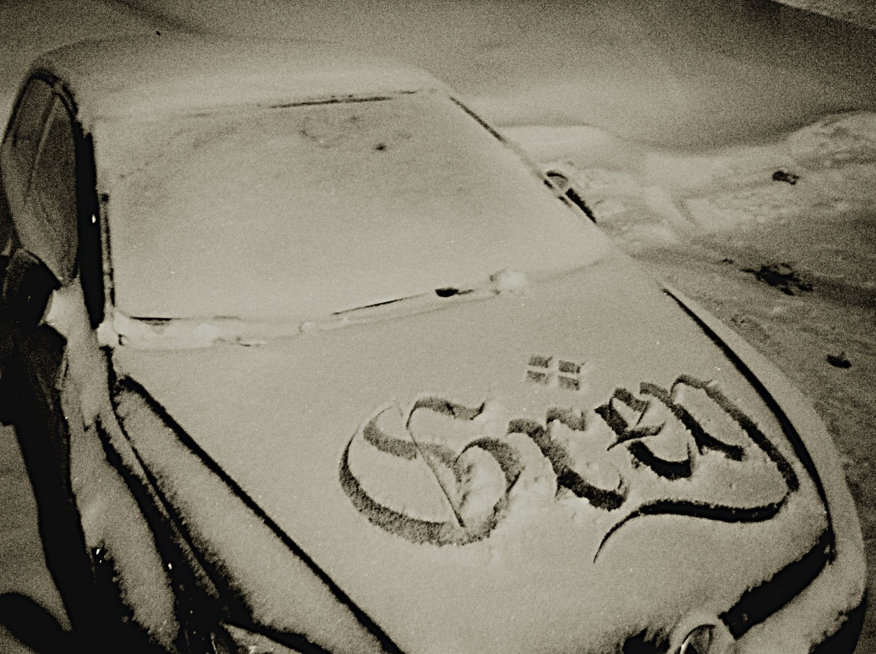
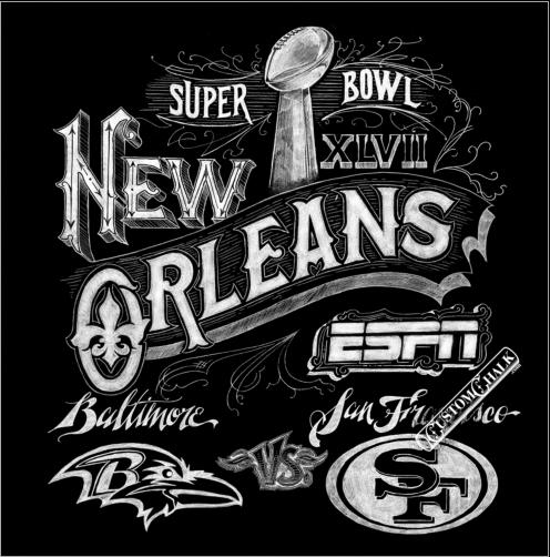
Unless you've been living under a rock the past few years, then you have probably noticed a bit of a resurgence in the art of the chalkboard. In terms of hand drawn signs, nothing is more popular than having a well laid out and beautifully written chalkboard sign. You can find these all over crafts websites and sites like Pinterest and Tumbler, but it's obvious that chalk lettering is a skill all on its on.
There are certain tricks and tools that all chalk letterers should know or have on hand.
For one, your chalk board need to be completely cleaned off and wet down so no previous projects show through.
For the chalk, plain white and nothing special will get the job done the best. If the chalk is damp then you will get a deeper white line.
You should have a damp rag and a bowl of water on hand to clear off mistakes and sketchy lines. Wet q-tips are also good to have on hand for small mistakes and fine details.
Another essential tool is a ruler to measure width and distance of your letters.
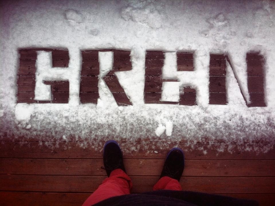
Looking at these signs you would think that hey, these people must have very steady hands in order to get such clean, crisp lines. That's only part of it.
There are different methods in which you can achieve such a clean almost, computer graphic quality to your chalk art.
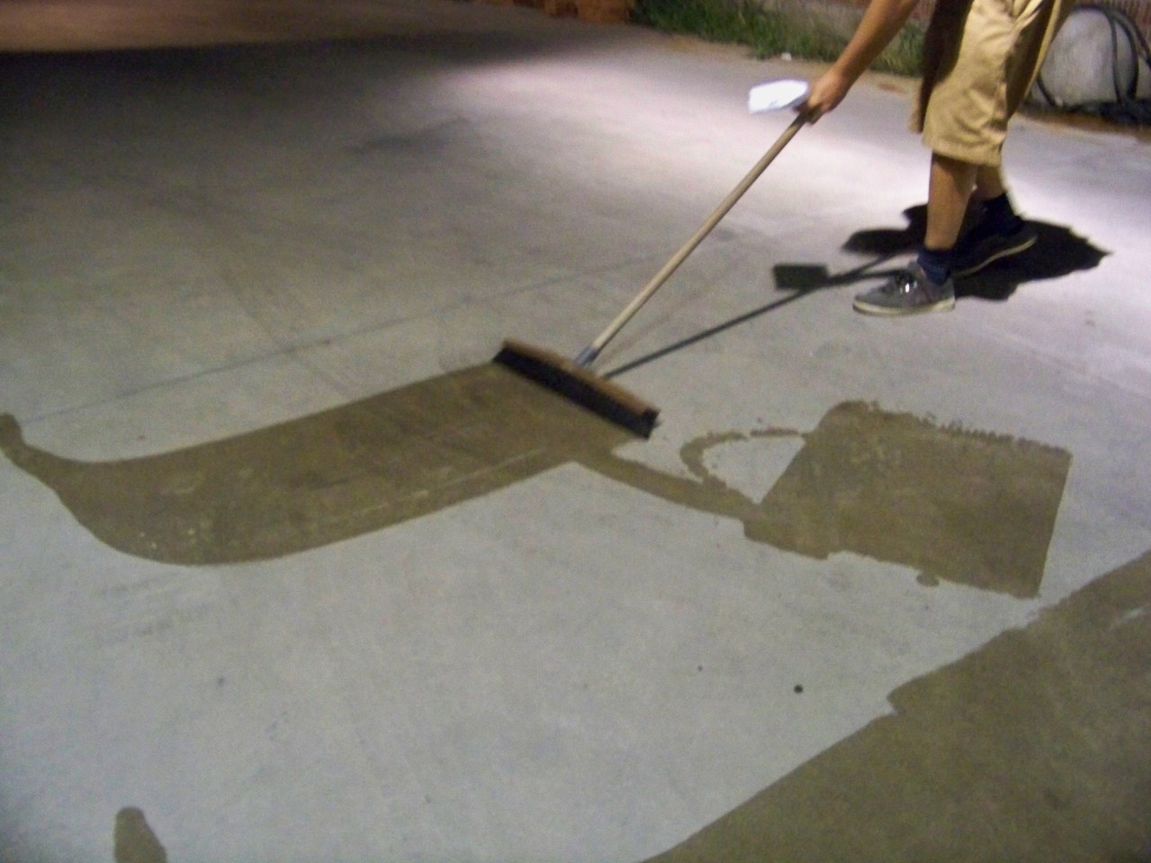
For some it is a matter of mapping out everything before ever touching the chalkboard. First everything is done on the computer and the it is printed and gridded out onto the chalkboard.
Rosemary Wannan
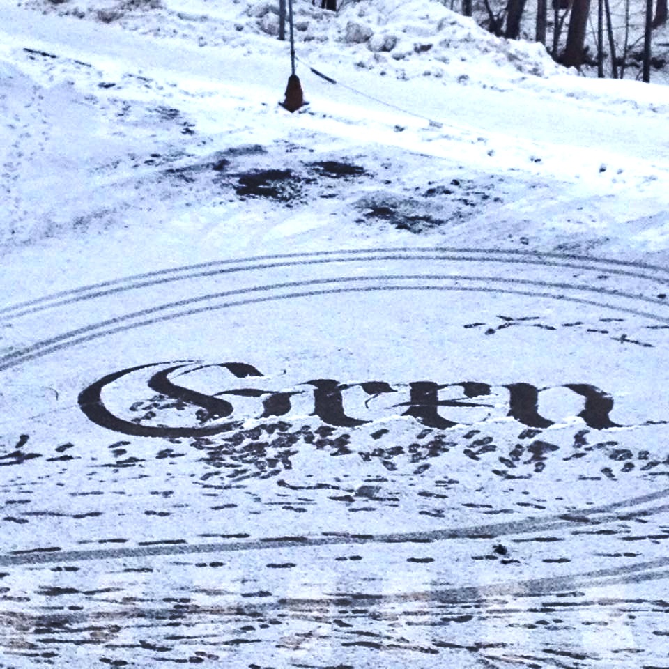
Another method is to upload your art onto a projector so that the chalk lettering becomes a matter of tracing the lines.
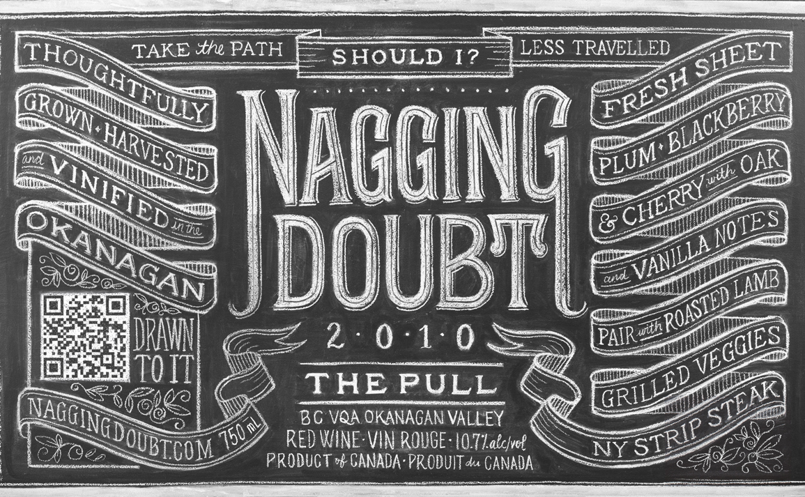
The most skilled and serious of chalk letterers achieve their art without the aid of any projectors or grids. They eye everything and use a ruler to gauge the width of the letters and the distance. It is time consuming, but the result is well worth the hassle.
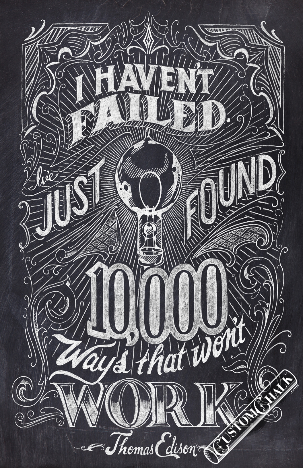
Famous chalk letterer Dana Tanamachi speaks about her method in lettering.
Dana Tanamachi
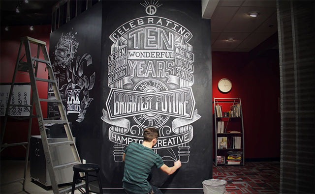
Nathan Yoder
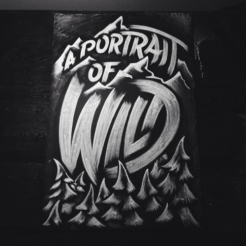
CJ Hughes
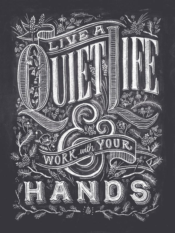
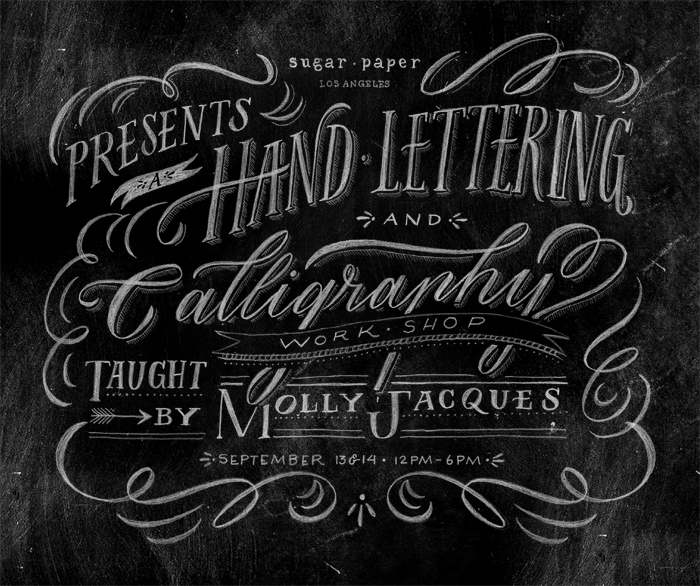
Molly Jacques


 (pen and ink)


