
In the world of expressive hand-drawn typography, one
designer reigns supreme: Dana Tanamachi. Remembered best for her unique and
unlikely medium of chalk, her work has been featured in restaurants and hotels
to magazines and even Google’s New York Offices.
While
attending a housewarming party where a friend had covered her walls with
chalkboard paint, Tanamachi drew a Victorian-inspired lettering of the word
“Brooklyn.” From that moment onward, her work exploded—first amongst friends at
parties, then Facebook, and eventually to clients such as Rugby Ralph Lauren.
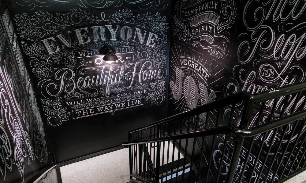
Watching
Tanamachi draw is just as mesmerizing as the work she produces. Many of her
fans, who only know her work through the internet, are used to seeing
time-lapse videos of her attacking empty chalk walls, and after such a time,
creating expressive pieces out of thin air. However, a behind-the-scenes look
shows that she has a process. She begins with a rough sketch, in which she
splits the drawing into sections. Each section is planned on tracing paper, so
that she is actually working in layers of type. This, through an intricate and
toilsome process, the lettering and illustrations are carefully drawn with
chalk and refined with wet rags. Pieces usually take eight to twelve hours to
complete, and are done in one sitting.
Amazingly,
every typeface she uses is original, and each piece usually contains five or
size typefaces. Tanamachi is constantly drawing letters and typefaces, and is
often inspired by her former boss, Louis Fili.
Surprisingly,
the majority of her work is not permanent. In an article with the Wall Street
Journal, she explains, “People tend to value my pieces more when they are aware
they could be gone in an instant.” Not to mention, the designer hates the
“splotchy sheen” that fixatives leave behind. So, not only is her work
beautiful, but fragile and temporary.
In addition
to her chalkboard typographic illustrations, she has created many products and
worked for a multitude of clients. She has completed projects for Burton Snowboards,
Nike advertisements, and many other things. However, each item always comes
back to her unique style and textured chalk-like lettering.
Other
designers, illustrators, and typographers that are similar to Tanamachi include
Louis Fili, Mary Kate McDevitt, and the Hampton Creative firm.
Websites
Dana Tanamachi's website- http://tanamachistudio.com/
Wall Street Journal Article-
http://online.wsj.com/news/articles/SB10001424052970203458604577265453430025274?mg=reno64-wsj&url=http%3A%2F%2Fonline.wsj.com%2Farticle%2FSB10001424052970203458604577265453430025274.html
Related Designers
Louis Fili- http://www.louisefili.com/
Mary Kate McDevitt- http://marykatemcdevitt.com/
The Hampton Creative- http://hamptoncreative.com/agency/
Images


Videos:
Nagging Doubt: The Pull- http://vimeo.com/25436331
Flourish (Personal Project with Andrew Ryan Shepherd)- http://vimeo.com/77128496
Ace Hotel Room- http://vimeo.com/23186260
No comments:
Post a Comment