
But in the modern context of the web, designers and typographers can choose to approach type in an open-ended, fluid way. I am interested to see how people are using technology to push the boundaries of type. These include motion graphics, web animations, and other experimental projects.
Franchise Animated
Motion graphics or kinetic typography was first used for the opening credits of movies in the 1950s – Hitchcock films being a prime example. It came out of a need to portray the mood of the film; the novelty was that motion could add character and emotion to information. Since then, kinetic typography has spread to television, advertisements, and the web.
One project I found that used kinetic typography in a collaborative way was Franchise Animated. Animography asked 110 animators around the world to pick a glyph and animate it in 25 frames and a 500 x 600 px canvas in After Effects. Each person had total creative freedom over their animation, so you’ll see in the video many different animation styles and techniques. This project stood out to me because it shows how expressive letters can be with motion. Even though the letterforms and color palette are kept consistent, each animator brings a personal touch to their share of the typeface.


Type Snap
Type Snap is an experimental web project made by graphic designer Masato Nakada. He wanted to create a typeface that is as dynamic as animated images like emojis and GIFs and efficient as texting abbreviations like OMG or BRB. Type Snap is a website that plays with how much one can read with letters cut in half. Site visitors can drag letters around to create and test their own words and phrases with the system. According to Nakada, “Typography will always evolve according to its new environment or context. Type Snap explores what typography can perform on the web. Not only does [splitting letters in half] increase reading speed, but we can now pack in more words and meaning. It’s no different to how a printer started to use movable type ligatures to increase their typing speed and legibility.”
Mutable Type
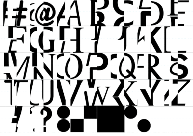
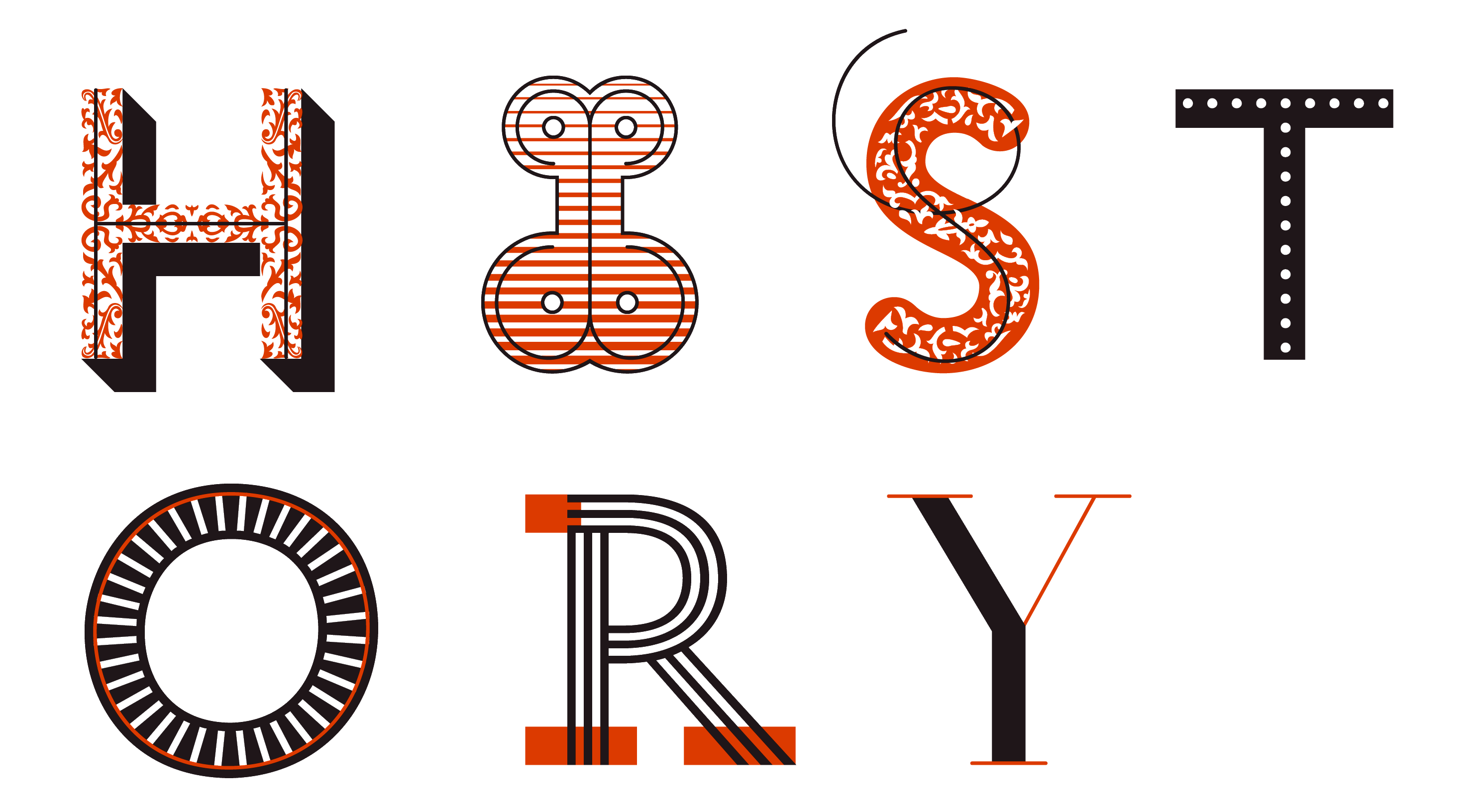
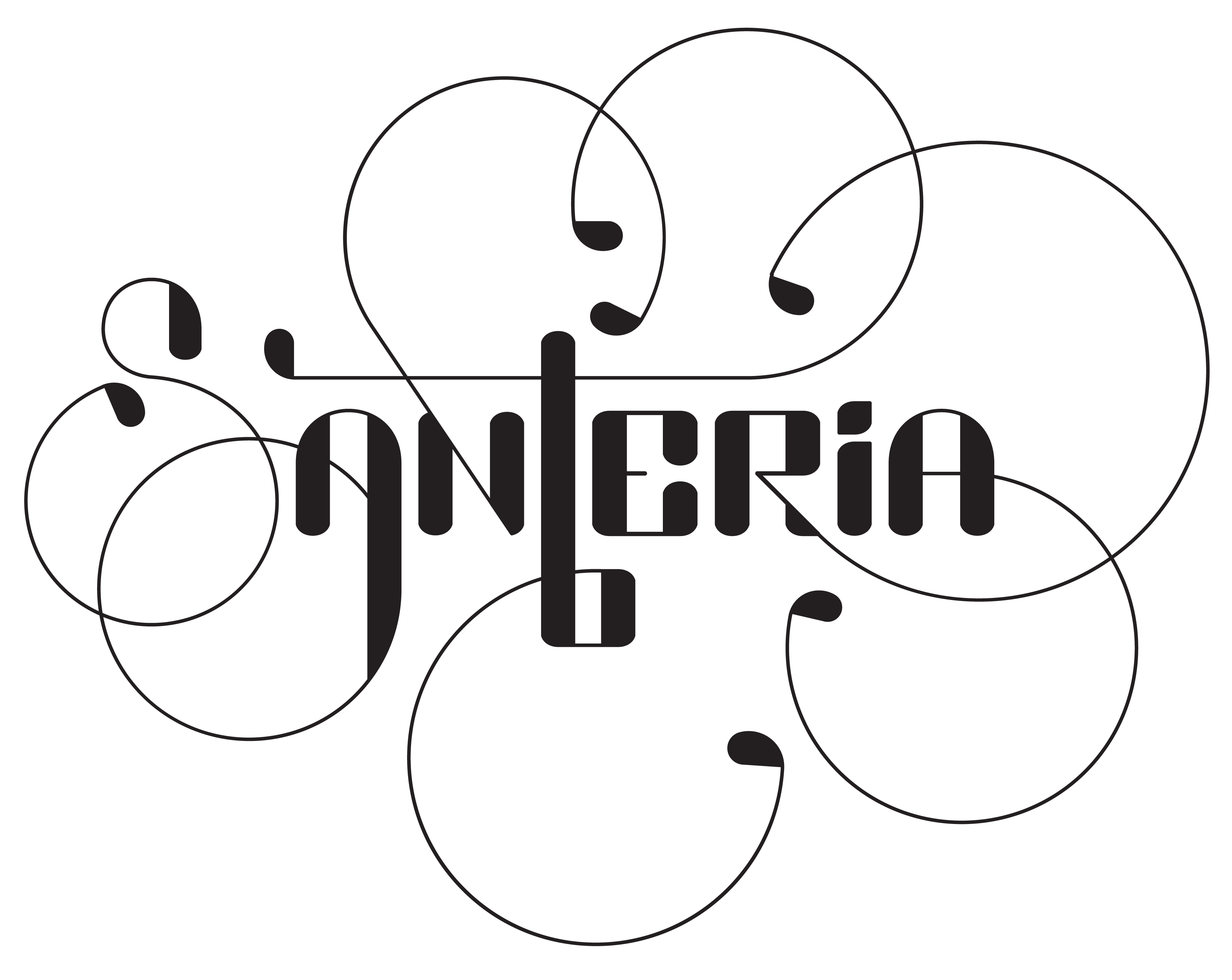
Mutable Type is a thesis project Rolando G Alcantara at the MICA cumulating in a zine and exhibition. “A typeface becomes mutable when it gives the typesetter many different ways to typeset the same message while maintaining a cohesive aesthetic,” he writes. “With mutable type, typographers have more power to change how they set the type, how that typesetting is displayed in any given media, and what parts of it might vary over time.” Below are works that he referenced as inspiration:
 |
Ed Interlock is a mutable typeface by House Industries. The typeface actively searches for the best combination of glyphs to achieve a more hand-done feel. |
 |
Hipstory, a typeface made with the additive layering method |
 | |
|
 |
AlphaBeta, a typeface made using different character glyph variations |
 |
Hipstory, a typeface designed using the additive layering method |
There is definitely a lot of potential when typography takes advantage of the medium of the web.
http://www.fastcodesign.com/3049351/can-cutting-letters-in-half-help-you-read-faster-online
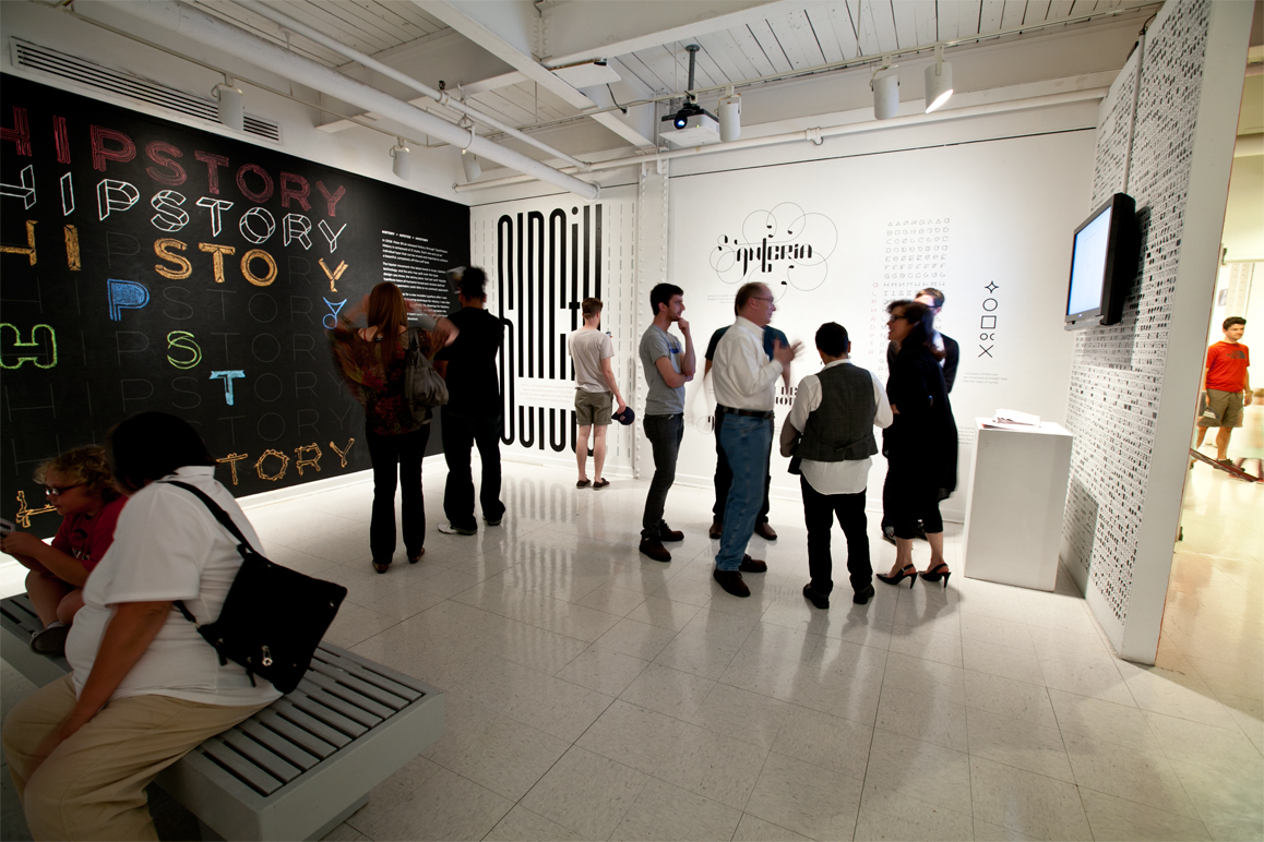
BONUS / Mutable Type Publication Design
With our Type Catalog assignment in mind, I digged a little deeper and found great examples of good layout and typography design in the thesis publication.


No comments:
Post a Comment