Arabic calligraphic scripts can be divided into two great families: the so-called rectilinear scripts (Kufic), and the cursive or round scripts. Although Kufic is too often presented as if it were a single, specific script among the rest, that is a mistake, and it can be only be reduced to a formula in an artificial way. To clarify this, I will briefly describe the respective history of these two families and explain their fundamental differences. (Note that all the names by which we designate the scripts are applied in retrospect. Period sources used them more fluidly if at all.
Kufic
In pre-Islamic days, writing was known to the peoples of the Arabian peninsula, and a rudimentary Arabic script was in use. It was rudimentary because they had little use for it, being a culture with a strong oral tradition, and the earliest texts that have come to us show all the awkwardness of a system that hasn't yet found its legs.
Then, almost overnight, they found themselves in the possession of something that needed to be preserved not only word for word, but down to the pauses between the words. That was the Qur'an, and it required a worthy transcription, with Arabic acquiring a special status, being seen as the language God chose for His revelation. The letters of the alphabet were now magical beings since they were capable of holding and preserving the divine Word.
round scripts
The round scripts are called in Arabic al-khatt al-mansûb, which is "the script that conforms, that is regulated". That is the main difference with Kufic: the round scripts are formal. There are very specific rules to write each letter and connect them together, rules to be practiced till the hand follows them automatically.
Bradbury Thompson was born in Topeka, Kansas, and lived from 1911 to 1995. In 1934, he graduated from Washburn College, and designed their first mascot in 1937. He was the art director of “Mademoiselle” from 1945 to 60, and designed “Westvaco Inspirations for Printers” from the 1930s to 62.
Alphabet 26
In 1958, Thomson began developing Alphabet 26, an attempt to streamline, simplify, and over all make the English alphabet more logically designed. According to Thomson, it is unreasonable for an alphabet of 26 letters to have 19 letters that change based on when they are upper or lowercase, and 7 where the upper and lowercase are identical. It is inconsistent, would not be accepted in other design, and makes it difficult for children to learn to read the language.
He also had issue with the similarities of some characters. “d,b,p, and q” are all very similar and often a point of confusion for children when first learning to read. The idea, in the end, would be a typeface with 26 distinct characters, specified as upper and lowercase by size.
Fonts have popped up, inspired by the original idea, such as “Mean 26”. Though this font is available in italics, where the “a” changes (a), which seems counterproductive to the initial idea.
Westvaco Inspirations
Westvaco Inspirations for Printers ran from 1925 to 62, with the purpose of demonstrating Westvaco Corporation's paper and printing process with design, photo, and fine art. Because of this, Thompson had a lot of creative freedom, needing to demonstrate several mediums and push what could be achieved on the paper.
Bradbury Thompson had a very distinct style in his magazine design, where he made use of type and color in order to interact with the space in ways that were very unconventional at the time. His layouts make great use of bright, attention grabbing color and strong imagery. More often than not, type and characters are used as both imagery and information.
Other magazines, like “Mademoiselle,” while showing strong signs of his design, show the limits of the cost of color and much less room for experimentation.
Evolution of Chinese
Characters
The
Chinese writing system is an unique phenomenon in the modern world of alphabet
scripts. Instead of a few dozen letters, it has developed thousands of complex
signs or "characters" that represent morphemes and words. Even
related writing systems such as Japanese and Korean, while sharing many of the
same characters, can fully function as purely phonetic scripts.
The
first recognizable form of Chinese writing dates from 3,500 years ago, but many
argue that its origins lie much deeper in the past. Regardless of its actual
age, Chinese has evolved substantially over time yet has retained its ancient
core, making it one of the longest continuously used writing system in the
world.
Original
Based
on pictographs, Chinese characters combine shapes with sounds and connotations
to form unique, block-shaped characters that carry meaning.
The
earliest form of Chinese writing is called the oracle bone script, used from
1500 to 1000 BCE. This script was etched onto turtle shells and animals bones,
which were then heated until cracks would appear.By interpreting the pattern of the
cracks, Shang court officials would make divinations of future events, hence
giving the name "oracle bones" to these animal bones.
Stages
of Chinese Writing
After the early evolution, the script continued to evolved. Visually it became increasingly more
linear, more stylized and less resembling of the natural objects. It also grew
in complexity, as the innovations of semantic determinatives (radicals) and
phonetic complements continued to be applied to form new words.
Scholars have conveniently divided
different styles of Chinese writing into a number of "scripts". The
following chart compares different Chinese characters in various forms
throughout time.
The
first four phases of Chinese writing trace the first 1,500-year history of
Chinese and essentially encompass the evolution from a nascent pictographic and
ambiguous writing script to a standardized system containing thousands of
characters still in use today.
Influence
As the only indigenous and the oldest
writing system in East Asia, the Chinese writing system became the inspiration
and the basis for many other East Asian writing systems, some prominent and
still in use, while other having faded into obscurity and disuse. Together they
are loosely called the Sinitic family of scripts, which includes the following
scripts.
Japanese
At first the Japanese
wrote fully in Chinese, but over time the Chine. The
result is a set of three scripts serving as a single writing system. One of the
scripts, kanji is essentially
Chinese characters, whereas the other two systems, hiragana and katakana
are simplified forms of certain Chinese characters and used exclusively to
represent sounds.
Korean
Writing
in Korea also started as an adoption of the Chinese script to fit the Korean
language, and as a result Chinese characters called hanja came to represent both words as well as sounds.
Khitan
The Khitan people were a powerful Mongolian
tribe that dominated Northern China and established the Liao dynasty between
the 10th and 12th centuries BCE and invented not one but two scripts both based
on Chinese and augmented to their language.
Vietnamese Chu Nom
means
"Southern Writing" and it was a script to write Vietnamese using
Chinese character construction principles. What this means is that traditional
radicals were paired with characters serving as phonetic components to
construct Chu Nom characters that represent Vietnamese words.
Friday, March 18, 2016
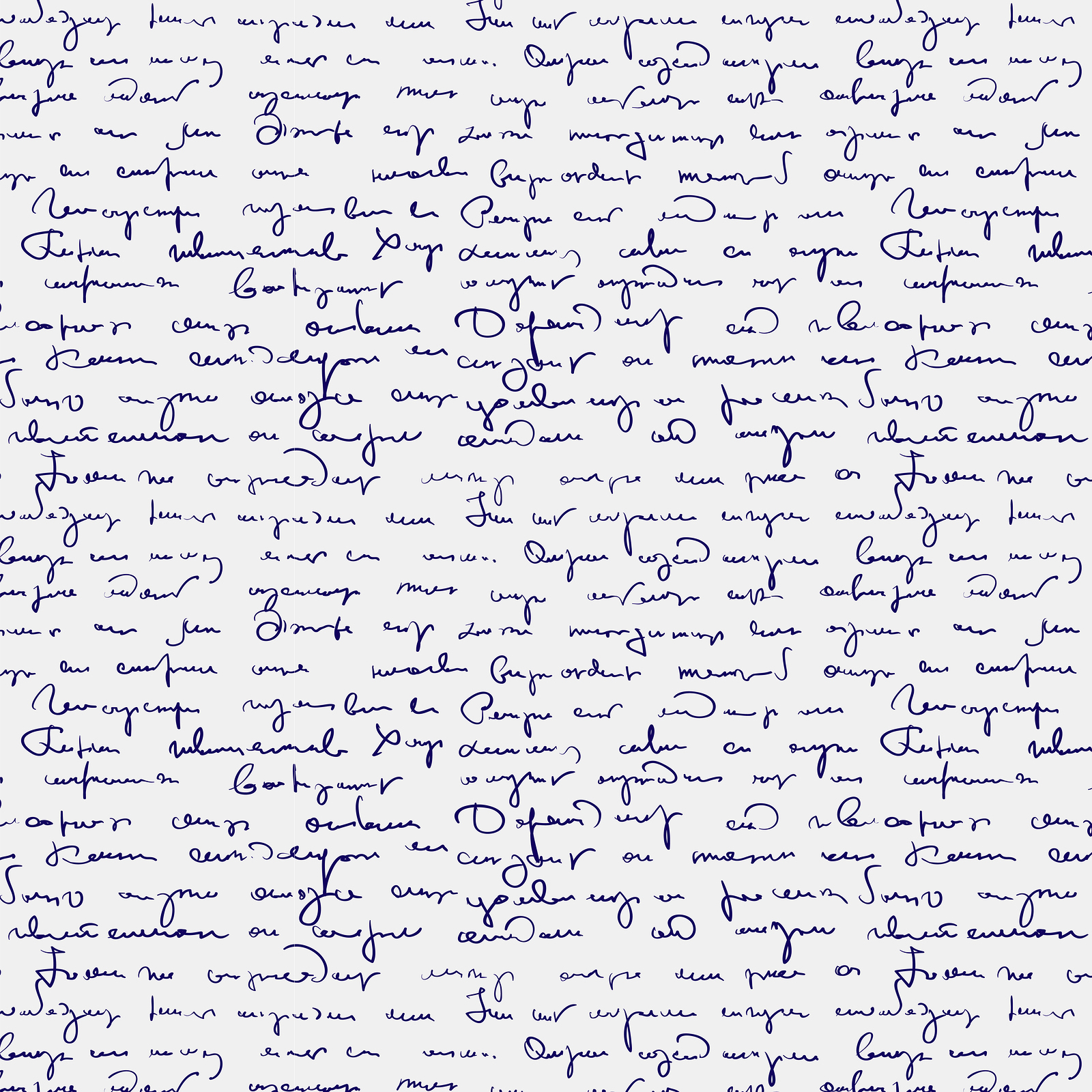
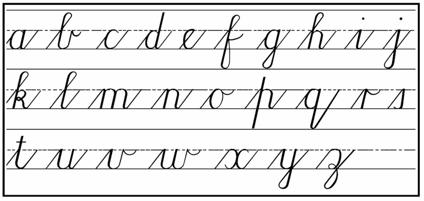
What happened to cursive writing?!
Schools no longer teach cursive hand writing. Instead we see students learning how to write individual letters and in many high schools and universities we see students using their computer to take notes. For many students cursive has become as foreign as Egyptian hieroglyphics. Now, schools have adapted national standards and cursive writing is not included in the program.
One reason for this is that educators seek to prepare students for a future that involves typing skills as opposed to penmanship. In a way cursive has become obsolete. It is a traditional skill that has been replaced by technology. Much of teaching time has been consumed with teaching standardized testing. This trend has been slowing declinging since 1970s.
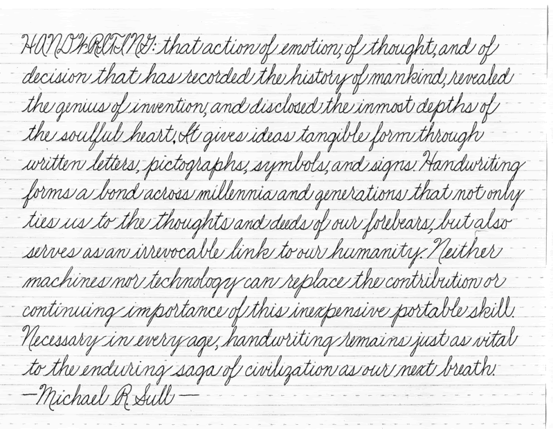
“The truth is that cursive writing is pretty much gone, except in the adult world for people in their 60s and 70s.” - Graham
"What I typically hear for keeping cursive is how nice it is when you receive a beautifully cursive-written letter. It’s like a work of art,” Graham said. “It’s pretty, but is that a reason for keeping something, given that we do less and less of those kinds of cards anymore?"
According to a 2006 College Board report, SAT essays written in cursive received a slightly high score than those with block print, but only 15 percent of the essays were written in cursive.
The first google doodle ever made was on August,30,1998. It's only 2 years after the two original creators of the site have built their idea in their Stanford dorm room, and less than a week before Google was even an official company. Larry Page and Sergey Brin went to a Burning Man festival and wanted to show people that they were away, so a stick figure was used to placed behind Google's second "o". This was merely a comical way to show that the founders were "out of office".
Burning Man Festival 1998
Because people loved it so much, Brin and Page decided that they will continue this idea with decorating the company's logo. Dennis Hwang, the (then-intern, now the company's webmaster) was asked in 2000 to draw more.
Halloween 1999
Halloween 2014
Thanksgiving 1998
First Day of Fall 2015 (Northern Hemisphere)
Google Doodles are now known for celebrating major holidays, famous artists and scientists around the world. The doodles have become more not only just a still image, but also more interactive through out the years.
Day of the Dead 2015
German Reunification Day 2015
First Day of School 2011 - Estonia, Poland, Russia
Starting in 2014, Google Doodle also started the annual contest called "Doodle 4 Google". This is a competition to have children create a Google Doodle logo for a $30,000 college scholarship, a T-shirt, google chromebook, Wacom digital design tablet, and a $5,000 technology grant of tablets or chromebooks towards their school.
My Best Day Ever... (2013), Winner: Sabrina Brady, Wisconsin, 10-12 grade level
Outside the lovely city of Las Vegas, surrounded by desert, is a typographer's dream. And this dream is The Neon Boneyard; a two-acre Museum which is home to over 250 historic signs. It is home to the most famous signs of Las Vegas, which include: Caesars Palace, Binion's Horseshoe, the Golden Nugget, The Stardust, Palms Casino Resort, New-New York, Lady Luck and O'Shea's.
Each of these signs have been donated or loaned by individuals, businesses or sign companies. The biggest contributor is a major sign manufacturer, YESCO. These ‘boneyards’ would house discarded signage to be used for their source parts or “bones” in the creation of newer, updated signage. As projects grew in scale, the sign makers could no longer house the volume of leftover signs and they began shipping used marquees straight to the dump. An outraged public, the Nevada Arts Council and YESCO stepped in to preserve the neon markers of Vegas past.
The signs' ages range from the 1930's to present day. And these typographic sculptures are tangible history of technology, industry, style, entertainment, pop culture, and most of all: design. You have the to experience of what it feels like to stand beneath a seventy-foot tall initial and to see up close the curves of a signature made of sheet metal.
"It’s hard not to be impressed by the physicality, craft, and art-form in the construction and precise details of every letter. Aside from the craft, you’ll see up-close letterforms that are so unusual, but reflective of an eclectic history that is now only barely captured in design books."
The Neon Museum can be visited 24 hours a day, 7 days a week. You can guide yourself through or sign up for a hour long guided tour.